- WGSN
- Style.com
- Vogue.com
- google.com
- Magazines such as; Vogue UK, LOVE magazine, Another, Pop, Fantastic man , Dazed and confused, Russh,, Numero, Vogue Homme, Purple, Self Service etc.
- Ice exhibition- Alpe D'Huez
- Magma books Manchester
- Manchester Food markets
- Preston Fish market
- Aple D'Huez restaurants and scenery.
Tuesday, 13 March 2012
Reading list
Whilst researching I have mainly used websites for references, be it for art directions or studying the A/W collections. Also presentation of foods and surroundings of the places i visited I have used as my resources.Here are the resources I used-
Monday, 12 March 2012
Magazine Layout


This page would have Fruits De Mer on it.


these 2 images would be on 1 page 1 on top of the other.

These 2 images would be on a double page spread facing each other filling both pages with a slight white boarder.
Here is a layout Idea for LOVE magazine.
I would have the front title page with credits, then onto first image that could have title on the page.
Possible Title page for LOVE magazine

taking inspiration from LOVE magazine I have come up with this front page to start my editorial still life.
Brainstorm of possible title

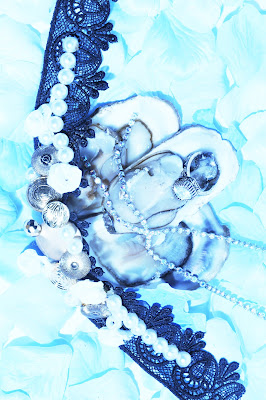
Here a did a mini brainstorm to try and think of a title name, there are a good range of possible names and all fit. However I feel that as i went to france and got my initial inspiration from france and as my shoot does look like its under the sea, I feel Fruits De Mer is perfect.
LOVE Magazine
I have also research LOVE as a possible choice for my shoot, at first in the early stages of research the feel and mood of the shoots in this issue below influenced me for my shoot, the cold, misty, icy and ghostly look and so I thought my shoot would probably fit perfectly in this magazine, I then researched layouts of shoots in this magazine to see how i would present mine.
I found that they normally have images taking up the hole page either 1 image to 1 page or 1 image over 2 pages, or they will have boarders either black or white. They have quite small writing at the bottom of images crediting the garments/ accessories in shoot and have a page before shoot dedicated as a title page giving a brief intro to the shoot and crediting stylist and photographer.


The four images above show a still life shoot, I thought it was beautiful and very cleverly done.
Photography by TOBY McFARLAN POND


This image influenced me to have movement in my shoot, this is where i got the smoke idea from.


This image inpsired me to have scattered petals under my oysters to create this icy/ white dreamy look.


This image inspired me for my colour scheme and icy feel, It is a MAC advertisment in LOVE magazine.


Vogue Magazine
When choosing a Magazine for my editorial still life to go into, I thought British Vogue would be perfect, they display bright colours and youth and also has this sense of purity and couture, which I think my shoot answers to all.
I think vogue is a good possibility for my shoot and so I have researched some of the layouts they use for there existing editorials in the magazine. They seem to always have a boarder and a big title, sometimes they will box an image with quite a lot of white space around it with credits either down the side of it or along the bottom.


Subscribe to:
Comments (Atom)