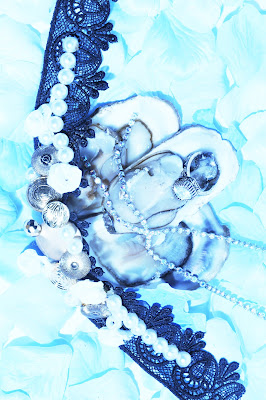
This page would have Fruits De Mer on it.
these 2 images would be on 1 page 1 on top of the other.
These 2 images would be on a double page spread facing each other filling both pages with a slight white boarder.
Here is a layout Idea for LOVE magazine.
I would have the front title page with credits, then onto first image that could have title on the page.


No comments:
Post a Comment