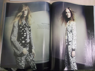
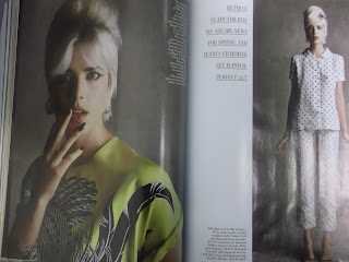
When choosing a Magazine for my editorial still life to go into, I thought British Vogue would be perfect, they display bright colours and youth and also has this sense of purity and couture, which I think my shoot answers to all.
I think vogue is a good possibility for my shoot and so I have researched some of the layouts they use for there existing editorials in the magazine. They seem to always have a boarder and a big title, sometimes they will box an image with quite a lot of white space around it with credits either down the side of it or along the bottom.


No comments:
Post a Comment