Monday, 12 March 2012

Final Five Images


Here is my final five images for my magazine editorial and I am very pleased with the outcome.
The smoke machine worked brilliantly and has really given me the feel and mood i wanted. I think the hole ghostly look has slightly gone in thsi shoot now but the blue/ white icy feel is still definatly there, it loks more under the sea now especially with the smoke looks like sand under the sea, however I am pleased with the direction it has gone in now.

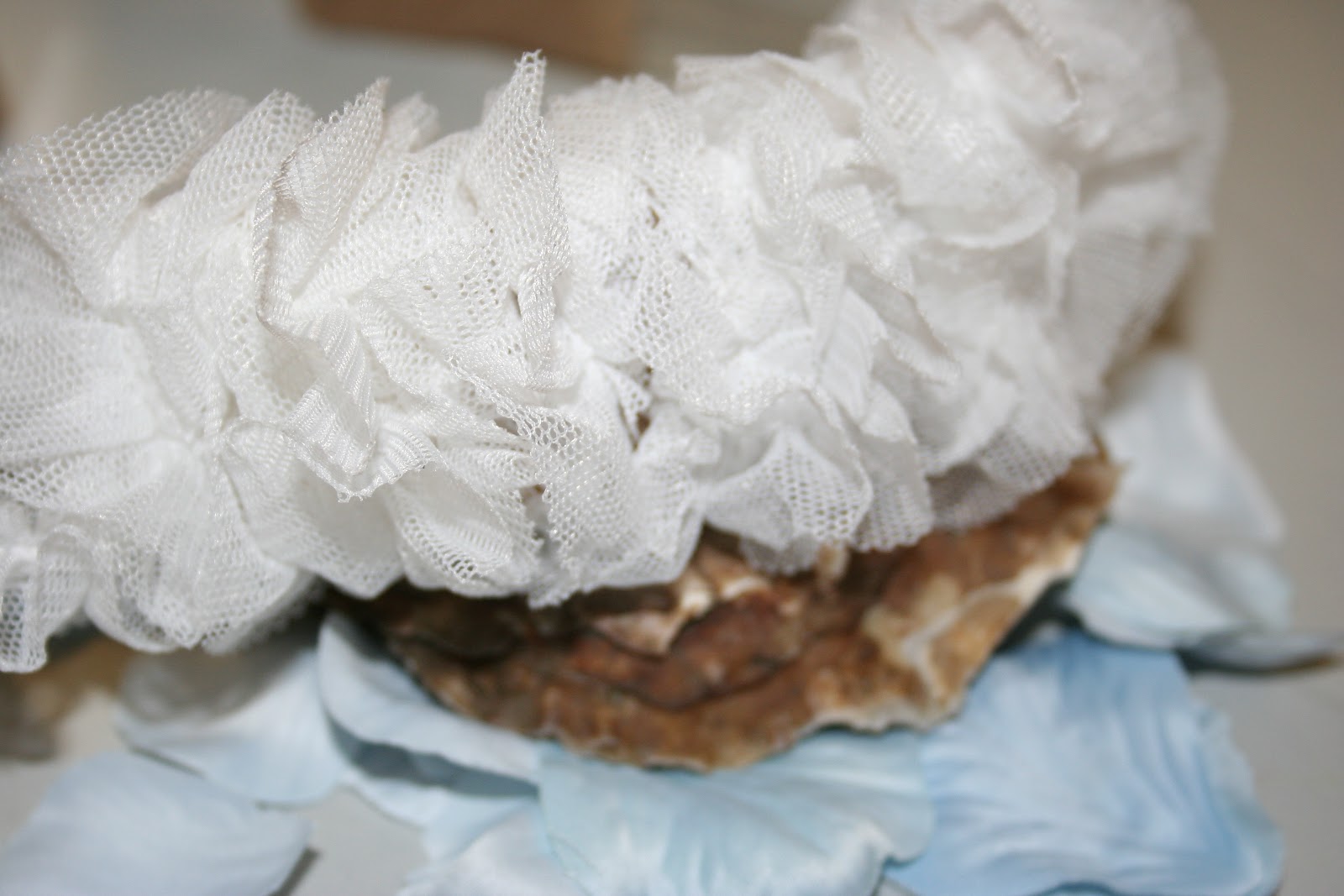
The only problems I ahve come across was the fact of the white head band, it was slightly different to the rest of the accessories so sometimes I felt it didnt really fit with the story and narrative, however now I think it has made the story and informed it more and now its one of my favourite images out of the five.

Edited images


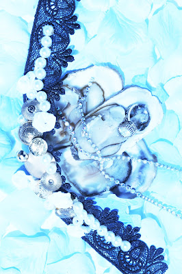
I edited down to these 7 images to then edit using effects in photoshop. I am wanted to create a cold icy look, very icy and blue. I am very pleased with these image and feel they really reflect my colour scheme and what I was going for.


Love this image, I feel it looks very cuture.

Oyster Shoot

This is my final shoot, these are just a few images from the shoot that highlight all the layouts and angles I did on the day.
There was a effect on my photographers camera that gave the images this icy blue effect that I absolutly loved, however we decided to do a few with the effect and a few without because i could always change the images to this effect on Photoshot in post production. 

This was the early stages of the shoot.
-jigsaw stands out, looks strong
-colour is beautiful
-Oysters look Icy and blue
-Love the effect


We then dropped a black background down behind the set, to then bring the smoke machine in. This black background enhanced the view of the smoke.  


To much smoke became a problem, was hard to get the right amount of smoke, however I got the knack, had to aim down towards the back of the set and blow gently.


At first I wasnt impressed with this angle and thought it looked too flat.
However it is now one of my favourite shots and really extenuates the jewelry especially the D&G earring. 


I think this image is really strong the contrast between the cold blues and the hard black choker.

Customisation

After having my idea set, colour scheme and thoroughly researched the A/W collections to inspire my accessories I started to customise. I sourced material from charity shops, fabric shops and my own, I then had to find jewels,buttons,beads, shells and flowers to decorate my accessories. I found the beads and buttons from a fabric shop, i sourced the jewels from my own collection of jewelry and all ready had some shells left over from a previous shoot.

I feel my accessories are very successful and I feel I have really recreated the designers looks. It looks a lot better than i thought it would and i think it is so successful because of careful sourcing and making sure the materials were the right quality.

Here is a test shot of close up of earring, this is the first draft of the earring as I added a few things onto it after this shot.


These are all my little bits that I spray painted to get the white/blue icy look.

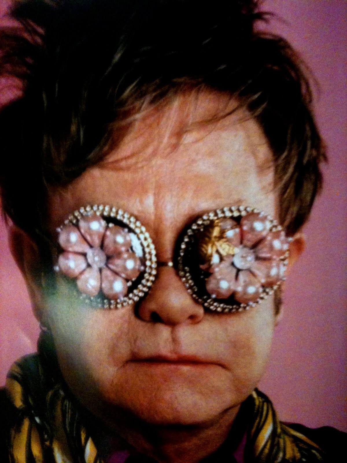
Here is the final draft of the earring, added 2 more beads and a jeweled button to create the odd shape Dolce & Gabbana did with there earrings.

Here is the white Dolce & Gabban head band after I had spray painted it, I feel it gave it the edgy kind of icy look I was going for.


This is the material I rapped around the headband, I sourced this from a material shop and i noticed it for its resembulance of snow and ice.


Oysters/ research

Here I have researched into the presentation of Oysters, I found something very interesting out and think it could be an option for my shoot title.
When i went to france and looked into food for inspiration I noticed that most fish was presented on ice and on platters, whilst researching I found a famous french dish that they call Fruits de mer that is pronounced like (free de mer) it means fruits of the sea. With this dish comes Oysters, prawns, crab, swuid and mussels. I want to see how my shoot works and and see how the title Fruits De Mer looks. 
Oysters have a very unique look.


Here is the french dish Fruits De Mer.


The inside of oysters are the most beautiful. The shape and colour is amazing, the hole look of oysters fits in with my colour scheme perftecly, they look very icy and cold.


Here is another example of the french dish Fruits De Mer.


Fruit De Mer

I want my shoot to have this kind of icy sea feel.

Thursday, 8 March 2012

Magazine/ Still life research


Still Life/ magazine research was a task that we had to do in small groups, we looked through all the high fashion magazines such as; pop, purple, fantastic man, self service and another magazine etc. the images below are not all but a selected of the still life we found interesting and inspiring. 
I found this task very inspiring, not only because we found some interesting imagery but also just being able to sit and look through magazines and analyse them. On top of that I feel 

Fantastic Man Magazine (2009)
fashion editorial using clutch bags,
photographed by Zoe Ghertner
Styled by Haidee Findlay-Levin,
Narrative Concept; The function of subversive decoration


POP Magazine, Spring/Summer 2011.
Fashion editorial entitled; Again, Again, Again
Photographed by Adam Broomberg and Oliver Chanarin
Stylist; Vanessa Reid


Dazed & Confused Magazine (2009)
Still life editorial entitled “The Time Capsule” photographed by David Hughes,
Narrative concept; The Decay of life and the evolution of time as portrayed through the eyes of designers


Purple Magazine; Featuring Damien Hirst & JayZ a contemporary editorial featuring displays of meat and fish, directed and styled by Damien Hirst.


POP magazine spring/Summer 2011
Photographer; Marius W Hansen,
Stylist; Laura Housley
A simple yet effective shoot showing how food and plant life relate back to the organic structured accessories of the spring/summer 2011 trends.